Dashboarding
This recitation was created by Nastya Oguienko and Justin Bois based on the lessons on dashboarding from previous versions of this course.
[1]:
import os
data_path = "../data/"

import numpy as np
import pandas as pd

import scipy.stats as st

import bokeh.io
import bokeh.plotting
import bokeh.models

bokeh.io.output_notebook()

# The following needs to be changed accordingly to your localhost
notebook_url = "localhost:8888"
Important! Interactive control of graphics does not work in Google Colab. You have to run these notebooks in Jupyter Lab on your local machine!
Also, dashboards will not appear in the HTML-rendered version of this notebook. You are therefore encouraged to download and run this notebook on your local machine.
In this portion of the recitation, we will create a dashboard with real data. A dashboard is a collection of interactive plots and widgets that allow facile graphical exploration of the ins and outs of a data set. If you have a common type of data set, it is a good idea to build a dashboard to automatically load the data set and explore it. Dashboards are also useful in publications, as they allow readers to interact with your result and explore them.
The data set
We will use as data set that comes from the Parker lab at Caltech and that you are already familiar with! But let’s remind ourselves one more time what this is all about. The lab studies rove beetles that can infiltrate ant colonies. In one of their experiments, they place a rove beetle and an ant in a circular area and track the movements of the ants. They do this by using a deep learning algorithm to identify the head, thorax, abdomen, and right and left antennae. While deep learning applied to biological images is a beautiful and useful topic, we will not cover it in this course (be on the lookout for future courses that do!). We will instead work with a data set that is the output of the deep learning algorithm.
For the experiment we are considering here, an ant and a beetle were placed in a circular arena and recorded with video at a frame rate of 28 frames per second. The positions of the body parts of the ant were tracked throughout the video recording. You can download the data set here: https://s3.amazonaws.com/bebi103.caltech.edu/data/ant_joint_locations.zip.
To save you from having to unzip and read the comments for the data file, here they are.
# This data set was kindly donated by Julian Wagner from Joe Parker's lab at
# Caltech. In the experiment, an ant and a beetle were placed in a circular
# arena and recorded with video at a frame rate of 28 frames per second.
# The positions of the body parts the ant are tracked throughout the video
# recording.
#
# The experiment aims to distinguish the ant behavior in the presence of
# a beetle from the genus Sceptobius, which secretes a chemical that modifies
# the behavior of the ant, versus in the presence of a beetle from the species
# Dalotia, which does not.
#
# The data set has the following columns.
#  frame : frame number from the video acquisition
#  beetle_treatment : Either dalotia or sceptobius
#  ID : The unique integer identifier of the ant in the experiment
#  bodypart : The body part being tracked in the experiment. Possible values
#             are head, thorax, abdomen, antenna_left, antenna_right.
#  x_coord : x-coordinate of the body part in units of pixels
#  y_coord : y-coordinate of the body part in units of pixels
#  likelihood : A rating, ranging from zero to one, given by the deep learning
#               algorithm that approximately quantifies confidence that the
#               body part was correctly identified.
#
# The interpixel distance for this experiment was 0.8 millimeters.
First, we need to load in the data and create columns for the x and y positions in cm and the time in seconds. Note that Pandas’s read_csv() function will automatically load in a zip file, so you do not need to unzip it.
[2]:
# Load data without comments
df = pd.read_csv(os.path.join(data_path, "ant_joint_locations.zip"), comment="#")

interpixel_distance = 0.08  # cm

# Create position columns in units of cm
df["x (cm)"] = df["x_coord"] * interpixel_distance
df["y (cm)"] = df["y_coord"] * interpixel_distance

# Create time column in units of seconds
df["time (sec)"] = df["frame"] / 28

df.head(10)
[2]:
| frame | beetle_treatment | ID | bodypart | x_coord | y_coord | likelihood | x (cm) | y (cm) | time (sec) | |
|---|---|---|---|---|---|---|---|---|---|---|
| 0 | 0 | dalotia | 0 | head | 73.086 | 193.835 | 1.0 | 5.84688 | 15.50680 | 0.000000 |
| 1 | 1 | dalotia | 0 | head | 73.730 | 194.385 | 1.0 | 5.89840 | 15.55080 | 0.035714 |
| 2 | 2 | dalotia | 0 | head | 75.673 | 195.182 | 1.0 | 6.05384 | 15.61456 | 0.071429 |
| 3 | 3 | dalotia | 0 | head | 77.319 | 196.582 | 1.0 | 6.18552 | 15.72656 | 0.107143 |
| 4 | 4 | dalotia | 0 | head | 78.128 | 197.891 | 1.0 | 6.25024 | 15.83128 | 0.142857 |
| 5 | 5 | dalotia | 0 | head | 79.208 | 198.697 | 1.0 | 6.33664 | 15.89576 | 0.178571 |
| 6 | 6 | dalotia | 0 | head | 79.663 | 198.069 | 1.0 | 6.37304 | 15.84552 | 0.214286 |
| 7 | 7 | dalotia | 0 | head | 81.485 | 198.142 | 1.0 | 6.51880 | 15.85136 | 0.250000 |
| 8 | 8 | dalotia | 0 | head | 81.835 | 198.350 | 1.0 | 6.54680 | 15.86800 | 0.285714 |
| 9 | 9 | dalotia | 0 | head | 83.263 | 197.934 | 1.0 | 6.66104 | 15.83472 | 0.321429 |
Sketching your dashboard
At this point, we know what the data set looks like. The first step to creating a good dashboard is to decide what you want to have on it! Think about: What kind of plot(s) should we make to visualize this data? What parameters might we want to change through interactive widgets?
It makes sense to begin with a hand-drawn sketch for what you want from the dashboard. Below is a reproduction of Justin’s first sketch (originally drawn on in collaboration with Cecelia Andrews, one of his former TAs) that he drew.
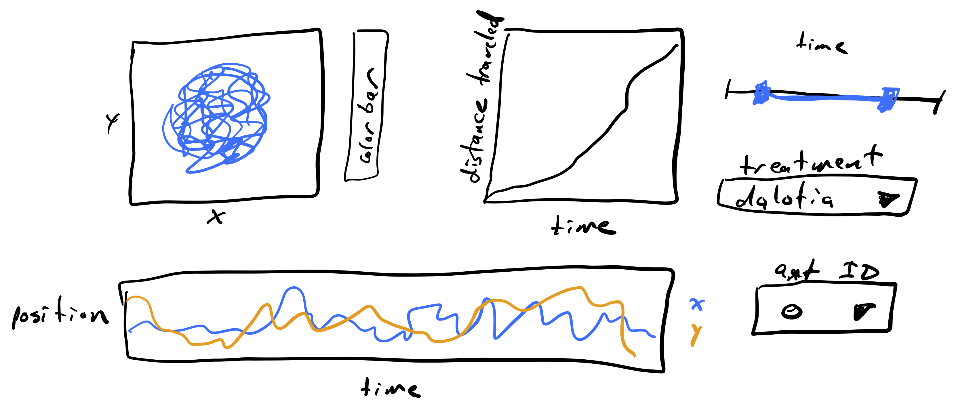
The plot to the upper left is a path with the position of an ant over time. We would like to have the path colored by how much time has passes so we can see time as well. The color of the time is encoded in the colorbar. Next to that plot is a plot of the total distance traveled by the ant over time. This could help visualize when the ant is walking fast and when it is stationary, along with the trajectory plot. At the bottom is another way of visualizing the trajectory of the ant, looking at the x- and y-position over time. To the right are widgets for selecting which to plot. The slider is a range slider, allowing selection of a time range. The range of times of the ant’s trajectory are chosen with this slider. Below that is a selector for which type of beetle is with the ant, either Dalotia or Sceptobius. Finally, there is a selector for the unique ID of the ant being displayed.
We will proceed by building the pieces of the dashboard one at a time to demonstrate how it is done, culminating in the finished dashboard.
Visualizing ant position over time
To visualize the ant’s position over time, we will make a plot using base Bokeh and use color to indicate time. Since we will do this over and over again, we’ll write a function to do this. Such a function, which would be common in a workflow, would be in the package you write to analyze these kinds of data.
We will first write a couple of functions that will create the ColumnDataSource object from a data frame (or a part of the data frame) which we will pass later to the plotting function:
[3]:
def extract_sub_df(df, ant_ID, bodypart, time_range=(-np.inf, np.inf)):
    """Extract sub data frame for body part of
    one ant over a time range."""
    inds = (
        (df["ID"] == ant_ID)
        & (df["bodypart"] == bodypart)
        & (df["time (sec)"] >= time_range[0])
        & (df["time (sec)"] <= time_range[1])
    )

    return df.loc[inds, :]


def build_cds(df, ant_ID, bodypart, time_range=(-np.inf, np.inf)):
    """Builds a ColumnDataSource object from the part of a given data frame,
    based on given ant_ID, bodypart and time range."""
    cds = bokeh.models.ColumnDataSource(
        extract_sub_df(df, ant_ID, bodypart, time_range)
    )

    return cds


def traj_plot(cds):
    """Make a plot of the trajectory in x-y plane."""
    p = bokeh.plotting.figure(
        width=350,
        height=250,
        x_axis_label="x (cm)",
        y_axis_label="y (cm)",
        x_range=[0, 20],
        y_range=[0, 20],
    )

    color_mapper = bokeh.models.LinearColorMapper(
        palette="Viridis256",
        low=0,
        high=np.max(df["time (sec)"]),
    )
    color_bar = bokeh.models.ColorBar(
        color_mapper=color_mapper, title="time (sec)", width=10
    )

    p.circle(
        x="x (cm)",
        y="y (cm)",
        source=cds,
        size=2,
        color={"field": "time (sec)", "transform": color_mapper},
    )

    p.add_layout(color_bar, "right")

    return p
Let’s make sure that the function works:
[4]:
ant_ID = 0
bodypart = "head"
cds_1 = build_cds(df, ant_ID, bodypart)

bokeh.io.show(traj_plot(cds_1))
Great! Now we can proceed to building interactions.
Building an interaction
Since these trajectories can be long, we may want to be able to select only a portion of the trajectory. To do this, we can use bokeh to make a range slider widget to select the interval. Let’s first make the widget.
[5]:
time_interval_slider = bokeh.models.RangeSlider(
    title="time (sec)",
    start=df["time (sec)"].min(),
    end=df["time (sec)"].max(),
    step=1,
    value=(df["time (sec)"].min(), df["time (sec)"].max()),
    width=300,
)
We now want to link this slider to the plot with a callback function. We also need to define initial source for plotting (and it should have a different name from the sources that were used before):
[6]:
cds_2 = build_cds(df, ant_ID, bodypart)

def callback(attr, old, new):
    # Slider values
    time_range=time_interval_slider.value

    # Renewing data in cds
    new_cds = build_cds(df, ant_ID, bodypart, (time_range[0], time_range[1]))

    cds_2.data.update(new_cds.data)
The last thing to do is to define when to use a callback function to update the information for plotting. We want to do this whenever the slider values are changed.
[7]:
time_interval_slider.on_change("value", callback)
Now everything is ready for plotting! Let’s create a layout of the plot and the widget:
[8]:
layout = bokeh.layouts.column(traj_plot(cds_2), time_interval_slider)
Finally, we need to build an application with Bokeh to be able to visualize all our efforts:
[9]:
def app(doc):
    doc.add_root(layout)

bokeh.io.show(app, notebook_url=notebook_url)
Throttling
In the plot above, the plot update lags behind the movement of the interval slider. This is because a lot has to happen to update the plot. A data frame is sliced, and a new plot is created and rendered. This happens very frequently, as Bokeh attempts to make updates smoothly as you move the slider.
We can instead throttle the response. A callback is a function that is evaluated upon change of a widget. Throttling the callback means that it only gets called upon mouse-up. That is, if we start moving the slider, the plot will not re-render until we are finished moving the slider and release the mouse button.
To enable throttling, we need to construct the interval slider using the value_throttled kwarg, which specifies for which values the throttling is enforced. Then, when using the callback functions, we use time_interval_slider.value_throttled instead of time_interval_slider.value.
Throttling is particularly useful when the callback functions take more than a couple hundred milliseconds to execute, as they do in this case. Let’s remake the dashboard with throttling.
[10]:
# Ranges of times for convenience
start = df["time (sec)"].min()
end = df["time (sec)"].max()

time_interval_slider_throttled = bokeh.models.RangeSlider(
    title="time (sec)",
    start=start,
    end=end,
    step=1,
    value=(df["time (sec)"].min(), df["time (sec)"].max()),
    width=375,
    value_throttled=(start, end),
)

# defining new source, callback function and on_change for the new slider
cds_throttled = build_cds(df, ant_ID, bodypart)


def callback(attr, old, new):
    # Slider values
    time_range = time_interval_slider_throttled.value_throttled

    # Renewing data in cds
    cds_throttled.data = extract_sub_df(
        df, ant_ID, bodypart, (time_range[0], time_range[1])
    )


time_interval_slider_throttled.on_change("value_throttled", callback)

layout = bokeh.layouts.column(traj_plot(cds_throttled), time_interval_slider_throttled)


def app(doc):
    doc.add_root(layout)


bokeh.io.show(app, notebook_url=notebook_url)
When using this slider, you will note that the plot is much quicker in its response because it is not being rerendered.
Now that you have grasped the main concepts of widget and dashboard coding, it’s a good time to stop. We will proceed with the rest of the sketched dashboard in the next part of the recitation.
Computing environment
[11]:
%load_ext watermark
%watermark -v -p numpy,scipy,pandas,bokeh,iqplot,jupyterlab
Python implementation: CPython
Python version       : 3.11.4
IPython version      : 8.12.0

numpy     : 1.24.3
scipy     : 1.10.1
pandas    : 1.5.3
bokeh     : 3.2.1
iqplot    : 0.3.3
jupyterlab: 4.0.4