R5. Overplotting
This recitation was adapted by Kayla Jackson from a previous BE/Bi 103 lesson and written in collaboration with Suzy Beeler.
[2]:
import glob
import numpy as np
import pandas as pd
import bebi103
import bokeh.palettes
import datashader
import holoviews as hv
import holoviews.operation.datashader
hv.extension("bokeh")
bebi103.hv.set_defaults()


Sometimes data sets have so many points to plot that, when overlayed, the glyphs obscure each other. This is called overplotting. In this recitation, we will explore strategies for dealing with this issue.
We will introduce a new high-level plotting package, HoloViews, that can use Bokeh to render plots. To set this up, we import HoloViews (as hv) and then set the HoloViews extension to be Bokeh using hv.extension('bokeh') at the top of the notebook.
One strength of the Holoviews package is that only minimal annotations to (tidy!) data are required to enable visualization. What’s more, Holoviews is part of the Holoviz ecosystem, allowing for easy integration with Datashader, a plotting package used for effectively visualizing even the largest of datasets. HoloViews is more or less indispensable if you want to make datashaded plots, which is why we use it here instead of base Bokeh, as we do throughout the class.
The data set
As an example, we will consider a flow cytometry data set consisting of 100,000 data points. The data appeared in Razo-Mejia, et al., Cell Systems, 2018, and the authors provided the data here. You can access one CSV file from one flow cytometry experiment extracted from this much larger data set here: https://s3.amazonaws.com/bebi103.caltech.edu/data/20160804_wt_O2_HG104_0uMIPTG.csv. This is the main data set for the lesson, but later on, we will use several others for a demonstration:
https://s3.amazonaws.com/bebi103.caltech.edu/data/20160805_wt_O2_HG104_0uMIPTG.csv
https://s3.amazonaws.com/bebi103.caltech.edu/data/20160807_wt_O2_HG104_0uMIPTG.csv
https://s3.amazonaws.com/bebi103.caltech.edu/data/20160808_wt_O2_HG104_0uMIPTG.csv
https://s3.amazonaws.com/bebi103.caltech.edu/data/20160811_wt_O2_HG104_0uMIPTG.csv
Let’s read in the data and take a look.
[3]:
df = pd.read_csv(
os.path.join(data_path, "20160804_wt_O2_HG104_0uMIPTG.csv"),
comment="#",
index_col=0,
)
df.head()
[3]:
| HDR-T | FSC-A | FSC-H | FSC-W | SSC-A | SSC-H | SSC-W | FITC-A | FITC-H | FITC-W | APC-Cy7-A | APC-Cy7-H | APC-Cy7-W | |
|---|---|---|---|---|---|---|---|---|---|---|---|---|---|
| 0 | 0.418674 | 6537.148438 | 6417.625000 | 133513.125000 | 24118.714844 | 22670.142578 | 139447.218750 | 11319.865234 | 6816.254883 | 217673.406250 | 55.798954 | 255.540833 | 28620.398438 |
| 1 | 2.563462 | 6402.215820 | 5969.625000 | 140570.171875 | 23689.554688 | 22014.142578 | 141047.390625 | 1464.151367 | 5320.254883 | 36071.437500 | 74.539612 | 247.540833 | 39468.460938 |
| 2 | 4.921260 | 5871.125000 | 5518.852539 | 139438.421875 | 16957.433594 | 17344.511719 | 128146.859375 | 5013.330078 | 7328.779785 | 89661.203125 | -31.788519 | 229.903214 | -18123.212891 |
| 3 | 5.450112 | 6928.865723 | 8729.474609 | 104036.078125 | 13665.240234 | 11657.869141 | 153641.312500 | 879.165771 | 6997.653320 | 16467.523438 | 118.226028 | 362.191162 | 42784.375000 |
| 4 | 9.570750 | 11081.580078 | 6218.314453 | 233581.765625 | 43528.683594 | 22722.318359 | 251091.968750 | 2271.960693 | 9731.527344 | 30600.585938 | 20.693352 | 210.486893 | 12885.928711 |
Each row is a single object (putatively a single cell) that passed through the flow cytometer. Each column corresponds to a variable in the measurement. As a first step in analyzing flow cytometry data, we perform gating in which properly separated cells (as opposed to doublets or whatever other debris goes through the cytometer) are chosen based on their front and side scattering. Typically, we make a plot of front scattering (FSC-A) versus side scattering (SSC-A) on a log-log scale. This is the plot we want to make in this part of the lesson.
A naive plot
Let’s explore this data using the Holoviews. We will make a call call to generate a Holoviews Points plot. Holoviews differentiates between Points and Scatter plots, depending on whether the variable on the y-axis is dependent on the variable on the x-axis. In the former plot, the variable on the y-axis is independent.
We will only use 5,000 data points so as not to choke the browser with all 100,000 (though we of course want to plot all 100,000). The difficulty with large data sets will become clear.
[4]:
hv.extension("bokeh")
hv.Points(
data=df.iloc[::20, :],
kdims=['SSC-A', 'FSC-A'],
).opts(
logx=True,
logy=True,
size=0.5,
)
[4]:
Yikes. Even though we set the glyph size to 0.5 and are only plotting 5% of the data, we see that many of the glyphs are obscuring each other, preventing us from truly visualizing how the data are distributed. We need to explore options for dealing with this overplotting.
Applying transparency
One strategy to deal with overplotting is to specify transparency of the glyphs so we can visualize where they are dense and where they are sparse. We specify transparency with the fill_alpha and line_alpha options for the glyphs. An alpha value of zero is completely transparent, and one is completely opaque.
[5]:
hv.extension("bokeh")
hv.Points(
data=df.iloc[::20, :],
kdims=['SSC-A', 'FSC-A'],
).opts(
logx=True,
logy=True,
fill_alpha=0.3,
line_alpha=0,
size=0.5,
)
[5]:
The transparency helps us see where the density is, but it washes out all of the detail for points away from dense regions. There is the added problem that we cannot populate the plot with too many glyphs, so we can’t plot all of our data. We should see alternatives.
Plotting the density of points
We could instead make a hex-tile plot, which is like a two-dimensional histogram. The space in the x-y plane is divided up into hexagons, which are then colored by the number of points that we in each bin.
HoloViews’s implementation of hex tiles does not allow for logarithmic axes, so we need to compute the logarithms by hand.
[6]:
df[['log₁₀ SSC-A', 'log₁₀ FSC-A']] = df[['SSC-A', 'FSC-A']].apply(np.log10)
Now we can construct the plot using hv.HexTiles().
[7]:
hv.extension("bokeh")
hv.HexTiles(
data=df,
kdims=['log₁₀ SSC-A', 'log₁₀ FSC-A'],
).opts(
colorbar=True,
frame_height=300,
frame_width=300,
)
[7]:
This plot is useful for seeing the distribution of points (it is akin to a histogram), but is not really a plot of all the data. We should strive to do better. Enter Datashader.
Datashader
HoloView’s integration with Datashader allows us to plot all points for millions to billions of points (so 100,000 is a piece of cake!). It works like Google Maps: it displays raster images on the plot that show the level of detail of the data points appropriate for the level of zoom. It adjusts the image as you interact with the plot, so the browser never gets hit with a large number of individual glyphs to render. Furthermore, it shades the color of the data points according to the local density.
Let’s make a datashaded version of this plot. Note, though, that as was the case with hex tiles, HoloViews currently cannot display datashaded plots with a log axis, so we have to manually compute the logarithms for the data set.
We start by making an hv.Points element, but do not render it.
[8]:
# Generate HoloViews Points Element
points = hv.Points(
data=df,
kdims=['log₁₀ SSC-A', 'log₁₀ FSC-A'],
)
After we make the points element, we can datashade it using holoviews.operation.datashader.datashade(). Note that we need to explicitly import holoviews.operation.datashader before using it.
[9]:
hv.extension("bokeh")
# Datashade
hv.operation.datashader.datashade(
points,
).opts(
frame_height=300,
frame_width=300,
padding=0.05,
show_grid=True,
)
[9]:
In the HTML-rendered view of this notebook, the data set is rendered as a rastered image. In a running notebook, zooming in and out of the image results in re-display of the data as an image that is appropriate for the level of zoom. It is important to remember that actively using Datashader requires a running Python engine.
Note that, unlike with transparency, we can see each data point. This is the power of Datashader. Before we delve into the details, you may have a few questions:
First, what exactly is Datashader?
Datashader is not a plotting package, but a Python library that aggregates data (more on that in a bit) in a way that can then be rendered by your favorite plotting package: Holoviews, Bokeh, and others. This graphic from the Datashader illustrates how all these packages interact with each other:
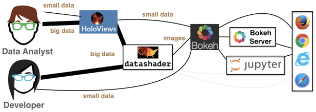
We see that the data analyst (i.e. you!) can harness the power of Datashder by using HoloViews as convenient high-level wrapper. Just as we’ve used HoloViews as an alternative to Bokeh for the small data we’ve encountered so far, HoloViews can handle big data as well via Datashader. While you have the option to interact with Datashader (and Bokeh) directly, this is generally not necessary for our purposes.
Second, how does Datashader work?
Datashader is extremely powerful with a lot happening under the hood, especially when interfacing with HoloViews instead of Datashader directly. However, it’s important to understand how Datashader works if you want to work beyond the default settings. The Datashader pipeline is as follows:
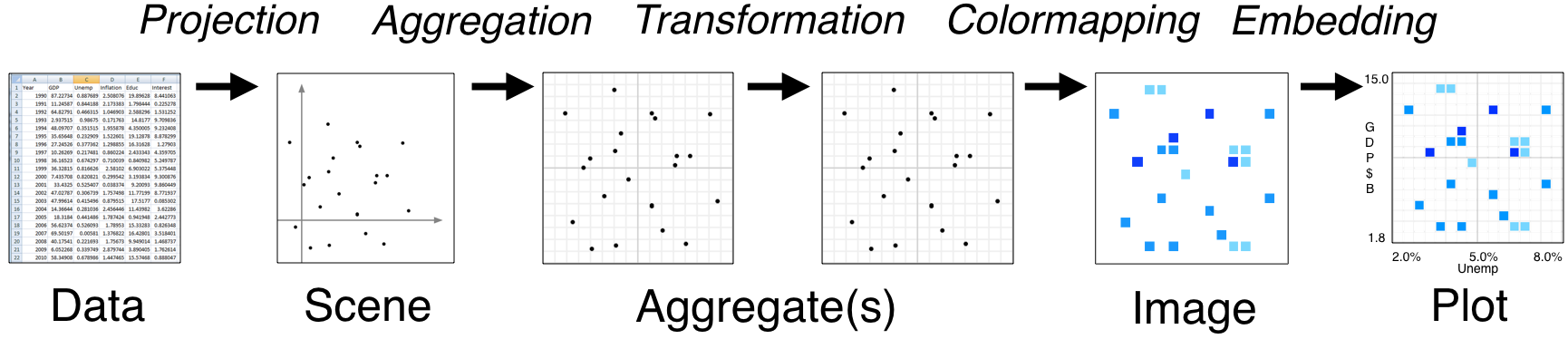
The first two steps are no different from what we’ve seen so far.
We start with a (tidy!) dataset that is well annotated for easy plotting.
We select the scene which we want to ultimately render. We are not yet plotting anything: we are just specifying what we would like to plot. That’s what we were doing when we called
points = hv.Points(
data=df,
kdims=['log₁₀ SSC-A', 'log₁₀ FSC-A'],
)
The next step is where the Datashader magic comes in.
Aggregation is the method by which the data are binned. In the example above, we binned by count, although there are other options. The beauty of Datashader is the this aggregation is re-computed quickly whenever you zoom in on your plot. This allows for rapid exploration of how your data are distributed at any scale.
Color mapping is the process by which the quantitative information of the aggregation is visualized. The default color map used above was varying shades of blue, but we could easily use a different color map by using the
cmapkeyword argument of the datashade operation.
All of this pipeline is accomplished in the hv.operation.datashader.datashade() function. You can read the documentation about different aggregators you can use. The default count aggregation is appropriate for most applications.
The cmap and cnorm kwargs of of particular interest. Setting the cmap allows for different coloring in the shading. The three types of normalization I typically use are linear (cnorm='linear'), logarithmic (cnorm='log'), and histogram equalization (cnorm='eq_hist'). Linear normalization scales the color of a rasterized pixel by the result of the aggregator (usually a count of the number of points lying within that pixel). Logarithmic normalization scales the color by the
logarithm of the number of pixels. Histogram equalization provides maximal contrast. The default is logarithmic, which tends to highlight the structure in the data. For linear normalization, the most dense regions dominate the plot and it is hard to see structure in less dense regions. Still, for many applications, linear normalization is appropriate, and I think it can be here for flow cytometry.
[10]:
hv.extension("bokeh")
# Datashade
hv.operation.datashader.datashade(
points,
cmap=list(bokeh.palettes.Magma10),
cnorm='linear',
).opts(
width=350,
height=300,
padding=0.05,
show_grid=True,
)
[10]:
And lastly comes the plotting.
As mentioned previously, Datashader is not a plotting package, but it computes rasterized images that can then be rendered nearly effortlessly with HoloViews or other plotting packages.
Now that we have a better handle on how Datashader works, let’s play around with more some more options.
Dynamic spreading
On some retina displays, a pixel is very small and seeing an individual point is difficult. To account for this, we can also apply dynamic spreading which makes the size of each point bigger than a single pixel.
[11]:
hv.extension("bokeh")
# Datashade with spreading of points
hv.operation.datashader.dynspread(
hv.operation.datashader.datashade(
points,
cmap=list(bokeh.palettes.Magma10),
cnorm='linear',
)
).opts(
frame_width=350,
frame_height=300,
padding=0.05,
show_grid=True,
)
[11]:
Datashading with more points
Datashader really shines when we have even more than 100,000 points. To demonstrate, we will borrow ideas from the Datashader’s docs, and generate 10 million random points that have some structure.
[12]:
# Generate points
rg = np.random.default_rng(seed=3252)
data_points = []
for _ in range(100):
rho = rg.uniform(-1, 1)
mu_x, mu_y, sigma_x, sigma_y = np.abs(rg.standard_normal(size=4))
cov = [
[sigma_x ** 2, rho * sigma_x * sigma_y],
[rho * sigma_x * sigma_y, sigma_y ** 2],
]
data_points.append(rg.multivariate_normal([mu_x, mu_y], cov, size=100000))
data_points = np.concatenate(data_points)
Now, we can make a plot of the points and datashade it.
[13]:
hv.extension("bokeh")
# Generate HoloViews points object
points = hv.Points(data=data_points)
# Datashade with spreading of points
hv.operation.datashader.dynspread(
hv.operation.datashader.datashade(
points,
cmap=list(bokeh.palettes.Magma10),
)
).opts(
frame_width=300,
frame_height=300,
padding=0.05,
show_grid=True,
xlim=(-15, 15),
ylim=(-15, 15),
)
[13]:
Note that the structure in the data is clear, even in dense regions.
Datashading overlays
We may have two or more data sets that we want to overlay, sharing each individually. Consider, for example, the flow cytometry data we have been plotting thus far. That experiment was repeated on five different days, August 4, 5, 7, 8, and 11, 2016. We can overlay the plot of the data for each day with data shading.
To do this, we start by making a data frame combining all of the data today. We make sure to add a “day” column so we can group by day later.
[14]:
# Get a list of the file names
files = [
os.path.join(data_path, "201608{0:02d}_wt_O2_HG104_0uMIPTG.csv".format(day))
for day in [4, 5, 7, 8, 11]
]
# Build a dataframe with all results
df = pd.DataFrame()
for fname in files:
# Parse day name from file name
day_ind = fname.find("_")
day = fname[day_ind - 2 : day_ind]
# Read in data set
df_ = pd.read_csv(fname, comment="#", index_col=0)
# Manually compute log scattering
df_[["log₁₀ SSC-A", "log₁₀ FSC-A"]] = df_[["SSC-A", "FSC-A"]].apply(np.log10)
# Add day column to data frame so we can groupby/overlay
df_["day"] = day
# Add it to the data frame
df = pd.concat((df, df_[["log₁₀ SSC-A", "log₁₀ FSC-A", "day"]]), ignore_index=True)
Next, we can make a plot where we overlay, just as we have been doing without Datashader. There is nothing new up to this point.
[15]:
points = hv.Points(
data=df,
kdims=["log₁₀ SSC-A", "log₁₀ FSC-A"],
vdims="day"
).groupby(
"day"
).overlay(
)
Now we can apply the datashading. The difference here is that we need to specify the aggregator to let Datashader know that it needs to aggegate by day, not everything together. We accomplish this with the datashader.by() function. It takes two arguments. The first is the name of the category we want to group by (in this case, "day"), and the second is what kind of per-category aggregation we want to do, (in this case count, which we specify as datashader.count()).
[16]:
hv.extension("bokeh")
# Store as variable for use in next code cell
plot = hv.operation.datashader.dynspread(
hv.operation.datashader.datashade(
points,
aggregator=datashader.by("day", datashader.count()),
)
)
# render
plot
[16]:
We see that the different days are represented in different colors and overlaid.
I would like to touch this plot up a bit though. First, I would like a legend. Datashaded plots do not really allow for legends, so we have to “hack” our way to a legend. The strategy is to make another plot with points of size zero that have the same color and overlay that with the datashaded plot. The default Datashader color cycle for overlays is given in datashader.colors.Sets1to3, so we can use that to generate the colors of our dummy plot.
[17]:
colors = datashader.colors.Sets1to3[0 : len(df["day"].unique())]
# Make colored points plot with invisible dots
color_points = hv.NdOverlay(
{
day: hv.Points(([df.loc[0, "log₁₀ SSC-A"]], [df.loc[0, "log₁₀ FSC-A"]]), label=str(day)).opts(color=color, size=0)
for day, color in zip(df["day"].unique(), colors)
}
)
Finally, we can overlay the dummy plot with the datashaded plot, adding some options. I would like a bigger frame and a black background color to see the points more clearly.
[18]:
hv.extension("bokeh")
(plot * color_points).opts(bgcolor="black", frame_width=400, frame_height=400, show_grid=False)
[18]:
We can see some structure in the data varies from day to day. In particular, the data from August 7 are shifted a bit toward larger side scattering.
Datashading paths
Datashader also works on lines and paths. I will use Datashader to visualize the scale invariance of random walks. First, I will generate a random walk of 10 million steps. For each step, the walker take a unit step in a random direction in a 2D plane.
[19]:
n_steps = 10000000
theta = rg.uniform(low=0, high=2*np.pi, size=n_steps)
x = np.cos(theta).cumsum()
y = np.sin(theta).cumsum()
We will plot it as a datashaded path.
[20]:
hv.extension("bokeh")
hv.operation.datashader.datashade(
hv.Path(
data=(x, y),
kdims=['x', 'y']
)
).opts(
frame_height=300,
frame_width=300,
padding=0.05,
show_grid=True,
)
[20]:
Computing environment
[21]:
%load_ext watermark
%watermark -v -p numpy,pandas,bokeh,holoviews,datashader,bebi103,jupyterlab
Python implementation: CPython
Python version : 3.11.5
IPython version : 8.15.0
numpy : 1.24.3
pandas : 2.0.3
bokeh : 3.2.1
holoviews : 1.17.1
datashader: 0.15.2
bebi103 : 0.1.17
jupyterlab: 4.0.6