Graphical model assessment
Thus far, we have not been terribly principled in how we have assessed models. By model assessment, I mean some metric, quantitative or qualitative, or how well matched the proposed generative model and the actual (unknown) generative model are. In my opinion, many of the most effective methods are graphical, meaning that we make plots of data generated from the theoretical generative model along with the measured data.
For this lesson, we will consider two method of graphical model assessment for repeated measurements, Q-Q plots and predictive ECDFs. We will also briefly revisit what we have done so far, the less-effective and soon-to-be-jettisoned method or plotting the CDF of the generative model parametrized by the MLE along with the ECDF. I note that we will not go over the implementation of these in Python here, but will rather cover the procedure and look at example plots. We will cover how to implement these methods in Python in the next lesson.
To have data sets in mind, we will revisit the data set from when we learned about the effects of neonicotinoid pesticides on bee sperm counts (Straub, et al., 2016). We considered the quantity of alive sperm in drone bees treated with pesticide and those that were not.
Before seeing the data, we may think that the number of alive sperm in untreated (control) drones would be Normally distributed. That is, defining \(y\) as the number of alive sperm in millions,
We already derived that the maximum likelihood estimate for the parameters \(\mu\) and \(\sigma\) of a Normal distribution are the plug-in estimates. Calculating these using np.mean() and np.std() yields \(\mu^* = 1.87\) million and \(\sigma^* = 1.23\) million.
Overlaying the theoretical CDF
Thus far, when we needed to make a quick sanity check to see if data are distributed as we suspect, we have generated the ECDF and overlaid the theoretical CDF. I do this here for reference.
This plot does highlight the fact that the sperm counts seem to be Normally distributed for intermediate to high sperm counts, but strongly deviate from Normality for low counts. It suggests that the bees with low sperm counts are somehow abnormal (no pun intended).
Though not useless, there are better options for graphical model assessment. At the heart of these methods is the idea that we should not compare a theoretical description of the model to the data, but rather we should compare data generated by the model to the observed data.
Q-Q plots
Q-Q plots (the “Q” stands for “quantile”) are convenient ways to graphically compare two probability distributions. The variant of a Q-Q plot we discuss here compares data generated by the model generative distribution parametrized by the MLE and the empirical distribution (defined entirely by the measured data).
There are many ways to generate Q-Q plots, and many of the descriptions out there are kind of convoluted. Here is a procedure/description I like for \(N\) total empirical measurements.
Sort your measurements from lowest to highest.
Draw \(N\) samples from the generative distribution and sort them. This constitutes a sorted parametric bootstrap sample.
Plot your samples against the samples from the theoretical distribution.
If the plotted points fall on a straight line of slope one and intercept zero (“the diagonal”), the distributions are similar. Deviations from the diagonal highlight differences in the distributions.
I actually like to generate many many samples from the theoretical distribution and then plot the 95% confidence region of the Q-Q plot. This plot gives a feel of how plausible it is that the observed data were drawn out of the theoretical distribution. Below is the Q-Q plot for the control bee sperm data using a Normal model parametrized by \(\mu^*\) and \(\sigma^*\). In making the plot, I use a modified generative model: and negative sperm count drawn out of the Normal distribution is set to zero.
The envelope containing 95% of the Q-Q lines is fairly thick, and closely matches the normal distribution in the mid-range sperm counts. We do see the deviation from Normality at the low counts, but it is not as striking as we might have through from our previous plot overlaying the theoretical CDF.
Predictive ECDFs
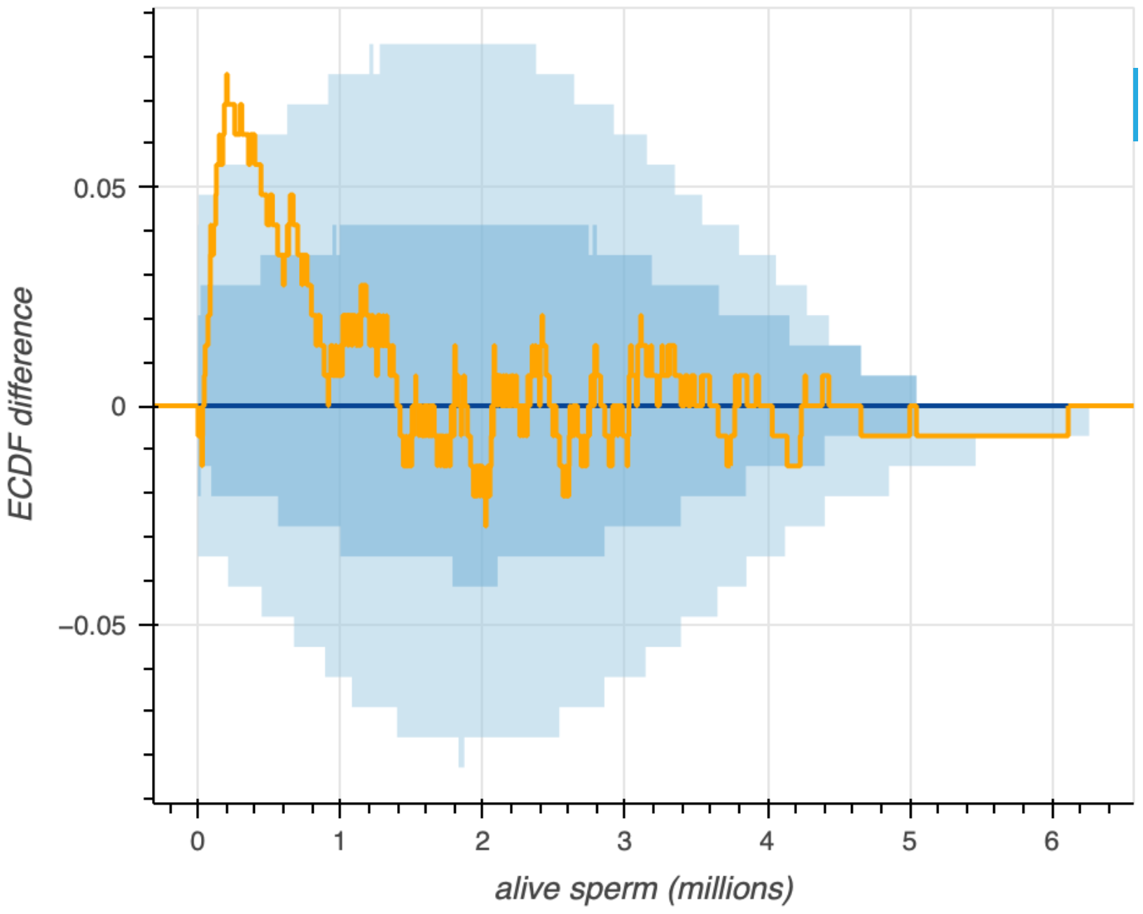
While Q-Q plots are widely used, I think it is more intuitive to directly compare a ECDFs of data made from the generative model to the ECDF of the measured data. The procedure for generating this kind of plot is similar to that of Q-Q plots. It involves acquiring parametric bootstrap replicates of the ECDF, and then plotting confidence intervals of the resulting ECDFs. I call ECDFs that come from the generative model predictive ECDFs. Below is a predictive ECDF for the bee sperm counts.
In this representation, the dark blue line in the middle is the median of all of the parametric bootstrap replicates of the ECDF. The darker shaded blue region is the 68% confidence interval, and the light blue region is the 95% confidence interval. Again, we see deviation at low sperm counts, but good agreement with the model otherwise.
Sometimes it is difficult to resolve where the confidence intervals of the ECDF and the measured ECDF diverge. This is especially true with a large number of observations. To clarify, we can instead plot the difference between the predictive and measured ECDFs.
Predictive regressions
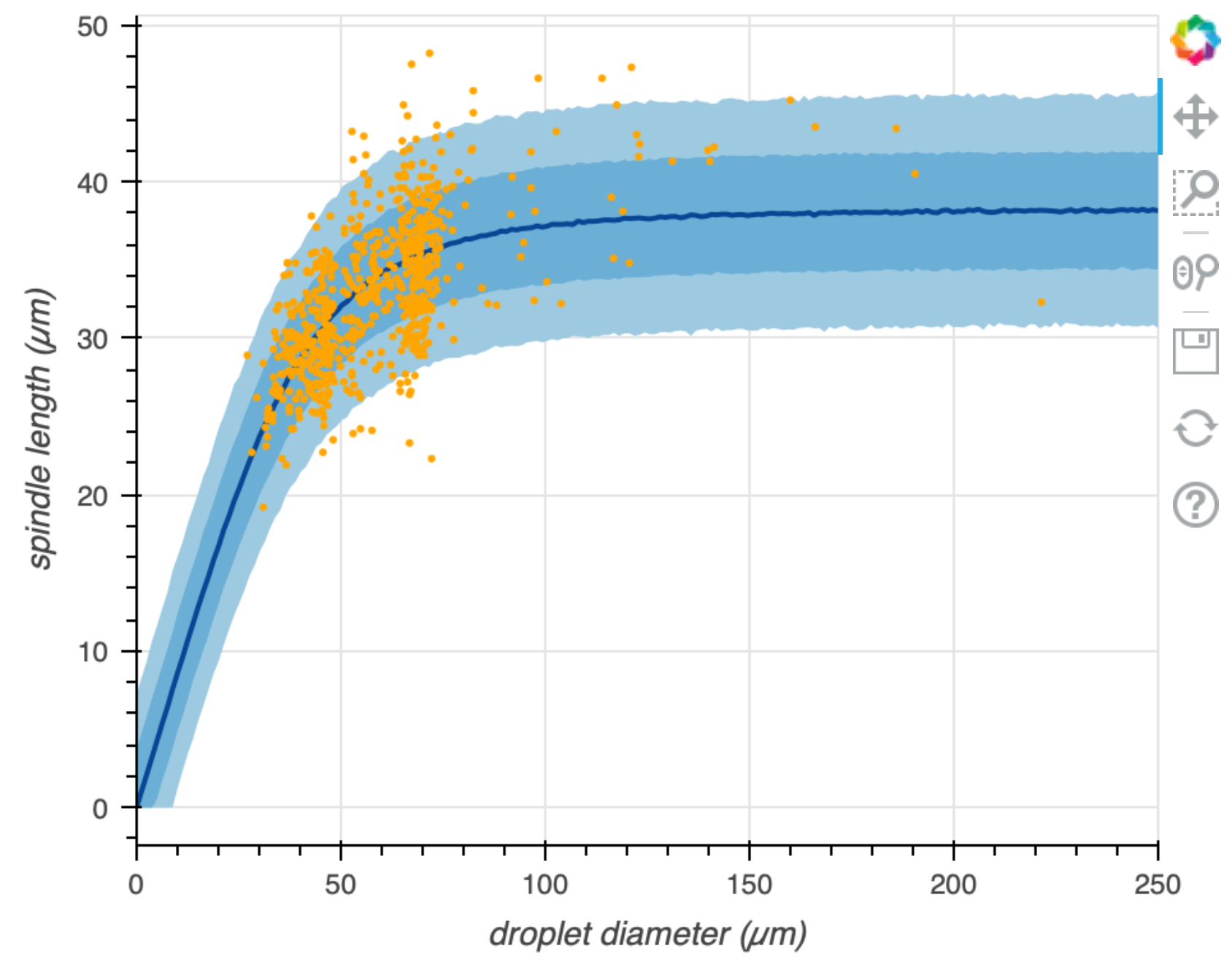
Predictive ECDFs makes an apples-to-apples comparison of the data that could be generated by a model and the data that were observed. We would like to be able to do the same for variate-covariate models. The approach is the same; we use the generative model parametrized by the MLE to make data sets for the variate for given values of the covariate. We then plot percentiles of these data sets along with the observed data. Such a plot is shown below for the now very familiar spindle-size data set from Good, et al.
General graphical model assessment
The examples of predictive ECDFs and predictive regression plots we have just seen are examples of graphical model assessment. The idea in both plots is to compare data that can be generated by the generative model and the data that were observed. Different kinds of measurements and different kinds of models may not lend themselves to the two example plots we have made. This does not mean you cannot do graphical model comparison! You can be creative in displays that allow comparison of generated and observed data, and many measurement/model pairs require bespoke visualizations for this purpose.
Graphical model comparison vs. NHST
Null hypothesis significance testing seeks to check if the data produced in the experiment are commensurate with those that could be produced from a generative model. The approach is to do that through a single scalar test statistic. The graphical methods of model assessment shown here also check to see if the data produced in the experiment are commensurate with those that could be produced from the generative model, but we check it against the entire data set, and not just a single test statistic. Importantly, graphical model assessment does not tell us how probable it is that the generative model is correct. What it does tell us is if the generative model could have produced the data we observed.